When Prague Kolektiv invited us into the kitchen of their new restaurant, it was immediately clear to us that the visual identity had to grow together with their new concept.
Mazel is a place unlike any other in Prague. A botanical concept home to more than fifteen hundred exotic plants creates an environment where you feel welcome, whether you're vegan, carnivore, or simply a lover of quality ingredients.
You'll quickly realize that everything revolves around a simple choice: meat or vegetables – or, MaZel. A union of two worlds that stand opposite each other, yet complement each other perfectly.
The whole visual style is built on a clear division of these two worlds through color and typography. The meat side works with red tones and a stark, no-frills font that evokes honest meat, rawness, craftsmanship, and strength. The vegetable side, by contrast, is fresh, lively, and just plain funky. The shade of green together with the typography symbolizes freshness, growth, and a touch of wildness.
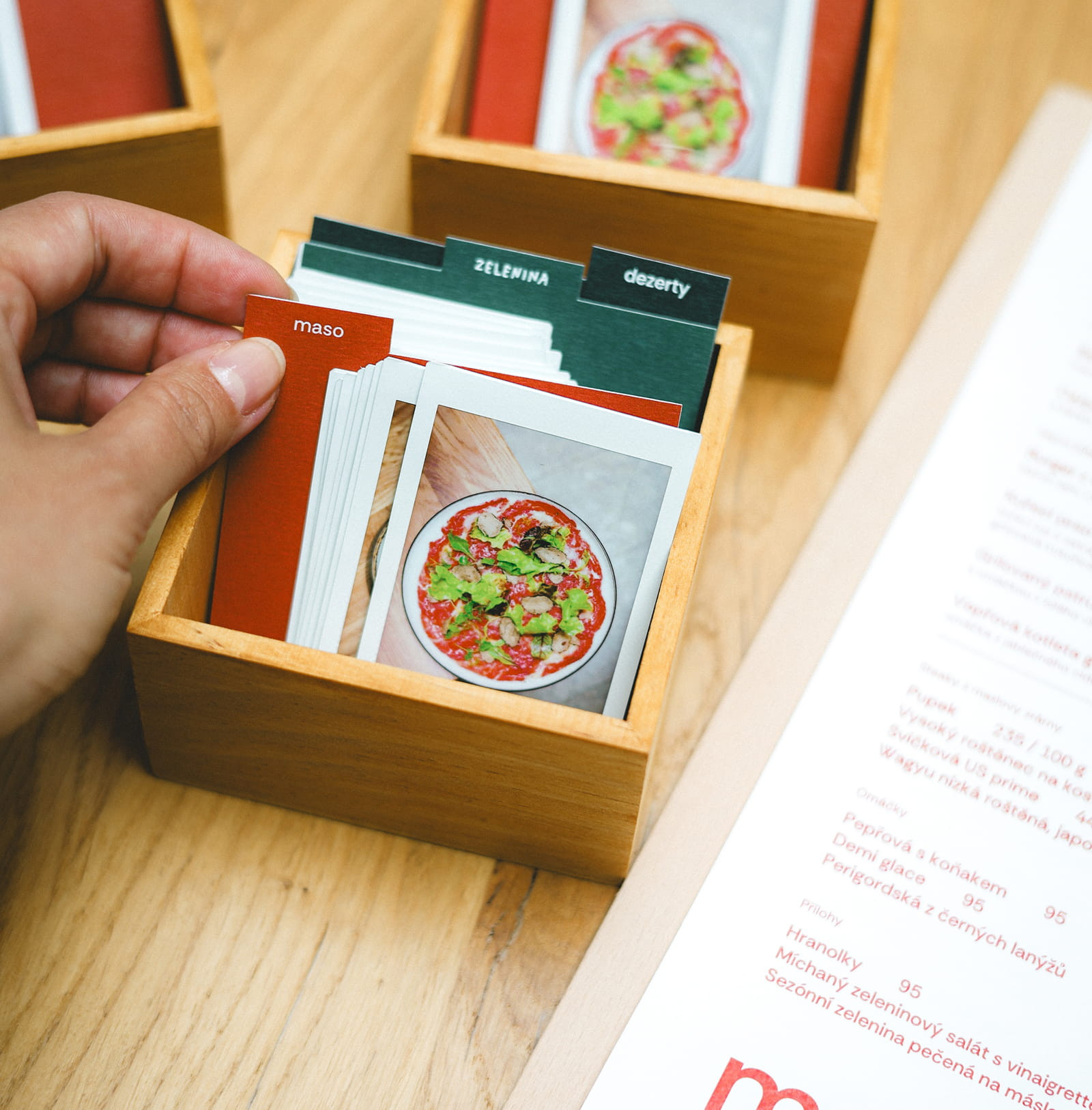
We also had fun with the visual style of promotional items, menus, and other printed materials, so that everything matched the restaurant's atmosphere and supported its character. A great example of how to grow into Mazel's heart is the menu made up of Polaroid photos, giving you an almost behind-the-scenes look into the kitchen.
And once you've made your choice, the same story continues on the restaurant's walls, only with photos showing what life at Mazel looks like, or who comes here to cozy up. The Polaroids thus become a natural part of the space and the digital world alike, as quiet carriers of the atmosphere.
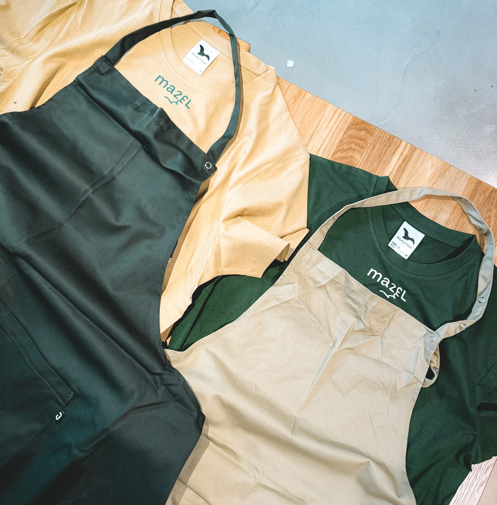
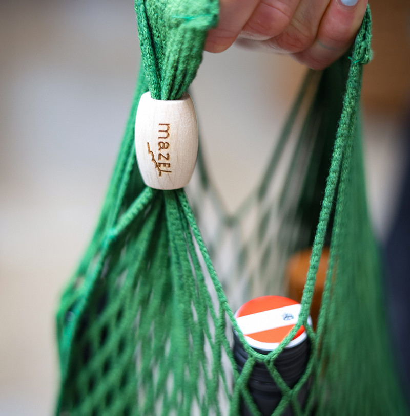
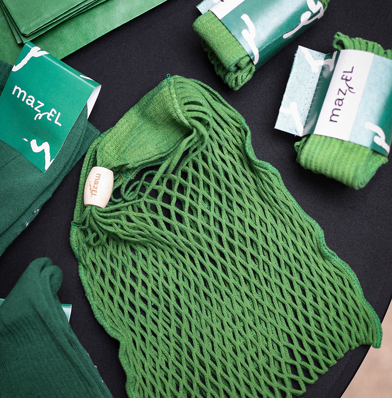
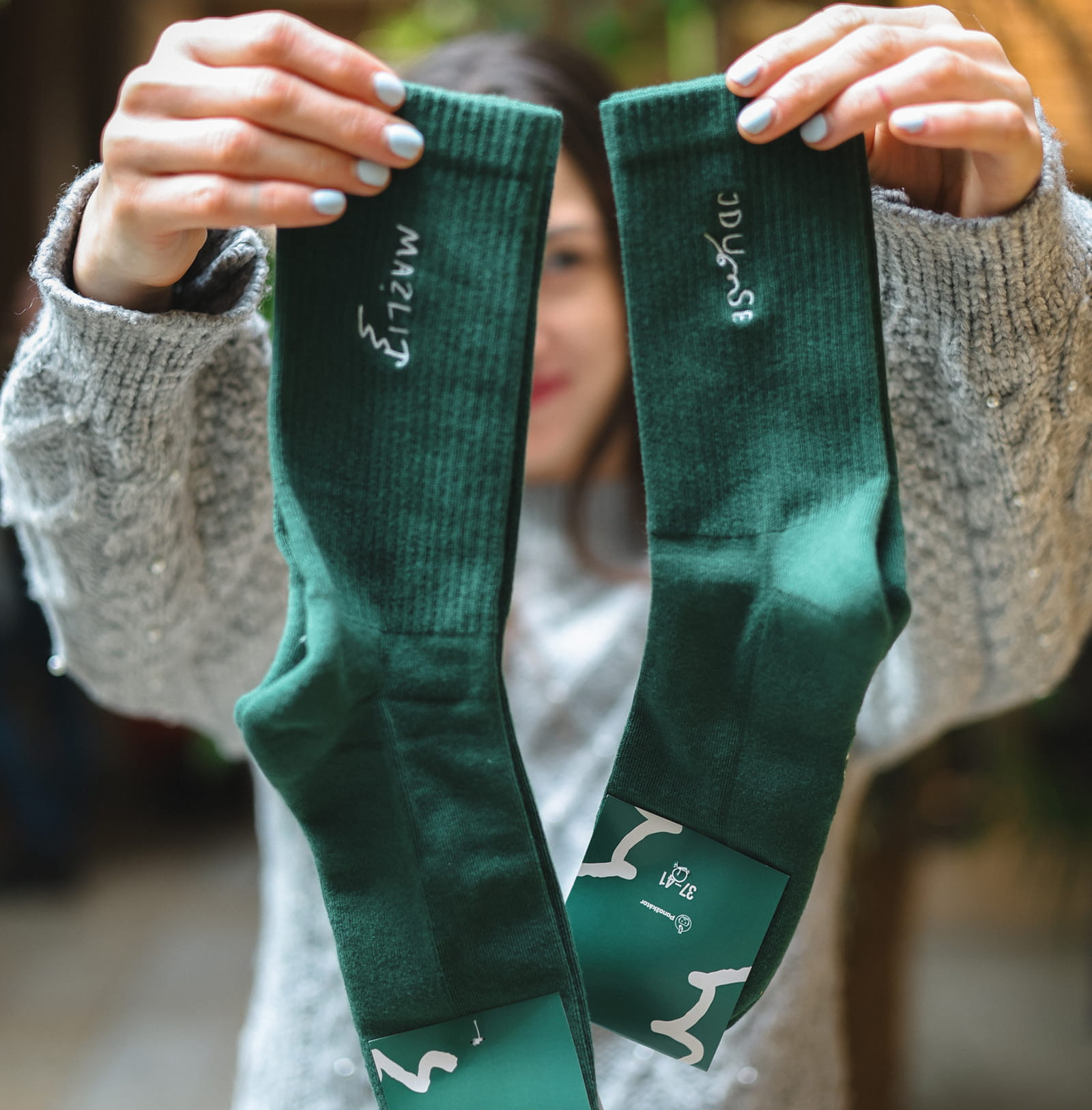
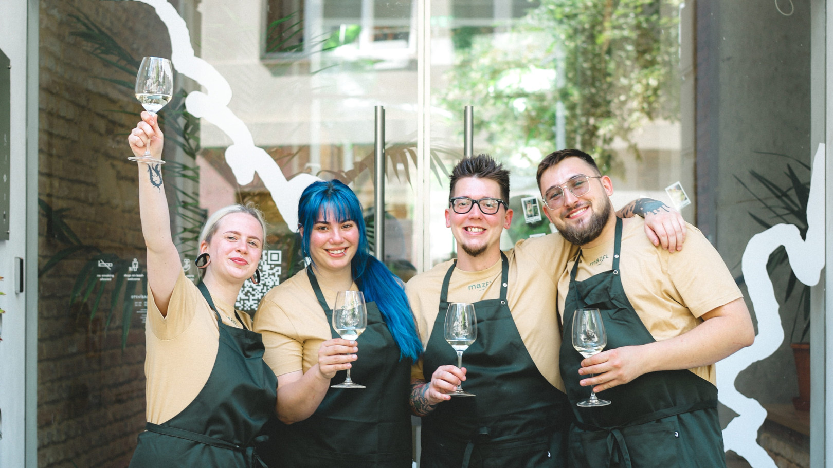
We didn't forget about the staff and merch either. The sharp-looking wardrobe speaks the same language as Mazel itself. Short, witty texts together with playful illustrations naturally fit into the life of the restaurant. And since this world doesn't end at the table, you can take a piece of it home with you too.